


今回は、HTMLとCSSだけで簡単に実装できる「hover時に波紋が広がるアニメーション」の方法をご紹介します。SNSアイコンやボタンなど、ちょっとしたアクセントを加えたいときにぴったりです。
今回の記事で分かること
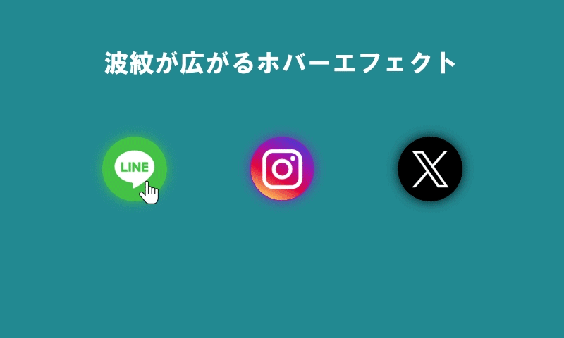
リンクボタンにマウスを乗せると、水面に波紋が広がるようなエフェクトの実装方法。
完成デモの紹介
まずはデモをご覧ください。
See the Pen 波紋が広がるhoverエフェクト by はなはな氏 (@wxftomuu-the-selector) on CodePen.
HTML
波紋のエフェクトは、対象の要素にクラス名.pulse-btnを付与するだけで簡単に適用できます。
LINEアイコンの画像は、Iconfinderから無料でダウンロードできます。InstagramとXのアイコンはfontawesomeを利用しています。
<!-- FontAwesomeの読み込み:アイコン用 -->
<link rel="stylesheet" href="https://cdnjs.cloudflare.com/ajax/libs/font-awesome/7.0.1/css/all.min.css" integrity="sha512-..." crossorigin="anonymous" referrerpolicy="no-referrer" />

<h3>波紋が広がるhoverエフェクト</h3>

<!-- SNSアイコンを並べるリスト -->
<ul class="menu-list">
  <!-- LINEボタン -->
  <li><a class="pulse-btn line" href="#">
    <img src="https://mrhanahana.com/cms/wp-content/uploads/2025/08/img_ico_LINE.png" width="60px"/>
  </a></li>

  <!-- Instagramボタン(FontAwesomeアイコンをCSSで挿入) -->
  <li><a class="pulse-btn instagram" href="#">
    <div class="icon"></div>
  </a></li>

  <!-- X(旧Twitter)ボタン(FontAwesomeアイコンをCSSで挿入) -->
  <li><a class="pulse-btn x" href="#">
    <div class="icon"></div>
  </a></li>
</ul>CSS
.pulse-btnにマウスを乗せたとき、::beforeと::afterの疑似要素を使って2つの同心円を描き、拡大しながら透明になっていく動きを@keyframesで実現しています。
/* =========================
   コンテンツ全体の基本スタイル
========================= */
/*
この部分は、アコーディオンを適用するための
サンプルレイアウト(見た目)のスタイルです。
実際のサイトに合わせて、自由にカスタマイズしてください。
*/
body {
  background: #1a8093;
}
h3 {
  text-align: center;
  color: #fff;
}
a {
  text-decoration: none;
}

/* アイコンリストの横並びレイアウト */
ul.menu-list {
  display: flex;
  list-style: none;
  justify-content: center;
  gap: 100px;
  margin-top: 80px;
  padding: 0;
}
@media only screen and (max-width: 599px) {
  ul.menu-list {
    gap: 50px;
  }
}

.icon:before {
  display: flex;
  justify-content: center;
  align-items: center;
  width: 3rem;
  height: 3rem;
  font-size: 2.5rem;
  color: #fff;
  padding: 10px;
  font-family: 'fontAwesome';
  border-radius: 50%;
}

/* 各SNSボタンの色や背景 */
.line {
  display: flex;
  justify-content: center;
  align-items: center;
  width: 3rem;
  height: 3rem;
  padding: 10px;
  background: #3DB156;
  border-radius: 50%;
  box-shadow: 0 0 10px rgba(61,177,86,0.6),
              0 0 20px rgba(61,177,86,0.4);
}
.instagram .icon:before {
  content: '\f16d'; /* FontAwesomeのInstagramアイコン */
  background: radial-gradient(circle at 30% 107%,
              #fdf497 0%,
              #fdf497 5%,
              #fd5949 45%,
              #d6249f 60%,
              #285AEB 90%);
  box-shadow: 0 0 10px rgba(207,46,146,0.6),
              0 0 20px rgba(207,46,146,0.4);
}
.x .icon:before {
  content: '\e61b'; /* FontAwesomeのXアイコン */
  background: #0F1419;
  box-shadow: 0 0 10px rgba(15,20,25,0.4),
              0 0 20px rgba(15,20,25,0.2);
}

/* ---------------------------------------------
  hover時に波紋が広がるエフェクト
---------------------------------------------*/
.pulse-btn:hover {
  position: relative;
  cursor: pointer;
}
/* hover時の波紋の擬似要素 */
.pulse-btn:hover::before,
.pulse-btn:hover::after {
  content: "";
  display: block;
  position: absolute;
  top: 0; bottom: 0; left: 0; right: 0;
  margin: auto;
  width: 100%;
  height: 100%;
  border: 1px solid #72C8D5; /* 波紋の色(初期) */
  border-radius: 50%;
  box-sizing: border-box;
  pointer-events: none;
  animation: pulsate 2s linear infinite; /* 波紋アニメーション */
}
/* SNSごとに波紋の色を変更 */
.pulse-btn.line:hover::before,
.pulse-btn.line:hover::after {
  border: 1px solid #3DB156;
}
.pulse-btn.instagram:hover::before,
.pulse-btn.instagram:hover::after {
  border: 1px solid #833AB4;
}
.pulse-btn.x:hover::before,
.pulse-btn.x:hover::after {
  border: 1px solid #0F1419;
}
/* 2つ目の波紋にディレイをかけてずらす */
.pulse-btn:hover::after {
  animation-delay: 1s;
}
/* 波紋が広がるアニメーション */
@keyframes pulsate {
  0% {
    transform: scale(1);
    opacity: 1;
  }
  100% {
    transform: scale(2);
    opacity: 0;
  }
}
まとめ
今回ご紹介したサンプルでは、HTMLとCSSだけで、マウスを乗せたときに水面に複数の波紋が広がるようなエフェクトを実装する方法を解説しました。 ボタンやリンクを目立たせたいとき、ちょっとした演出を加えたいときに、ぜひ活用してみてください。
また、弊社では「サイトの更新に手が回らない」「同じように実装したけれどうまく動かない」といった方のために、更新作業の代行や技術的なサポートも承っております。お気軽にご相談ください。
本記事が少しでもお役に立てれば幸いです。最後までお読みいただき、ありがとうございました。